Assess the current Uber Eats application on accessibility standards, and redesign the app to accommodate everyone.

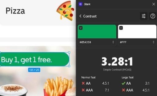
There are multiple examples, such as the labels which show the promotions on certain items or restaurants, where the contrast of normal text does not meet the WCAG 2.1 accessibility guidelines.
There are certain labels missing to form fields such as the search bar, it contains placeholder text, but no label.
Therefore, screen reader software for the visually impaired can not read the search field's label to the user, making it practically invisible to them.
Besides this there are simply many alt-tags missing from things as fundamental to the user flow as back buttons, which are just read out as: "unlabeled button".
As mentioned before, there are certain flaws in the Uber Eats app from the perceivable category, which translate to the operable category. Namely, the side scrolling, which is not only impossible for the visually impaired, but can also pose difficulties for people with limited motion or impaired fine motor skills. The same applies for some of the buttons which are simply too small to be activated successfully by people with limited movement.
Another major flaw is that there is no dark mode in the Uber Eats app. Many people prefer dark mode, and it may be helpful to people with epilepsy or sensitive eyes access the app.
Hereby the list of people who the app is not accessible to grows longer, including people with Parkinson's Disease, or Arthritis, Amputees, and people with limited movement, may it be temporary or permanent.
There are also some things that stood out to me when looking at the understandable portion of the WCAG's guidelines.
Once again the culprit is the mix of vertical and horizontal scrolling. This can be especially hard to understand for people who are not very tech-savvy, such as elderly people, or people in emerging countries first experiencing the digital age, without witnessing the progression from Web1.0 to Web3.0. The same applies to people who might have some form of cognitive impairment and therefore struggle to understand the two dimensional app structure.
Additionally, the complexity of the apps navigation is simply overloaded with options and elements, (creating a sitemap of the existing app sounds daring) which makes it hard for the abovementioned crowd to get from opening the app to completing checkout, as it is hardly a linear user flow, which does not intuitively direct the user to the goal, and therefore narrows the conversion funnel of the app significantly.
A discussed in the "perceivable" category above, assistive technology such as screen readers require the correct labeling of the alt tags corresponding to elements on the page. Although the app is compatible with iOS's and Android's screen readers, it is hardly optimized for the use of such software.
It is possible to toggle all elements, but it gets tricky when there are auto animations which do not interact well with the screen readers software.
The app allows filters within the OS to adjust colours for people with different types of colour blindness, but has none native to the app.